Flexbox vs Grid - The Ultimate Showdown
Today we answer the question that has plagued front-end developers for the last decade…or at least since 2017. Flexbox is an oldie, but a goodie, and perhaps the default when you are handed a half-finished design. Or maybe you found Flexbox to be a one-trick pony; the pumpkin latte of css layouts. In comes Grid, the younger and more attractive model. Grid says, “Get rid of those hacky solutions and set widths, I’ll do all the heavy lifting.” In the following post we’ll briefly discuss Flexbox, Grid, and their separate use cases. Not everything is as it seems.
“Have you ever wondered if there was more to life, other than being really, really, ridiculously good looking?”
— Derek Zoolander

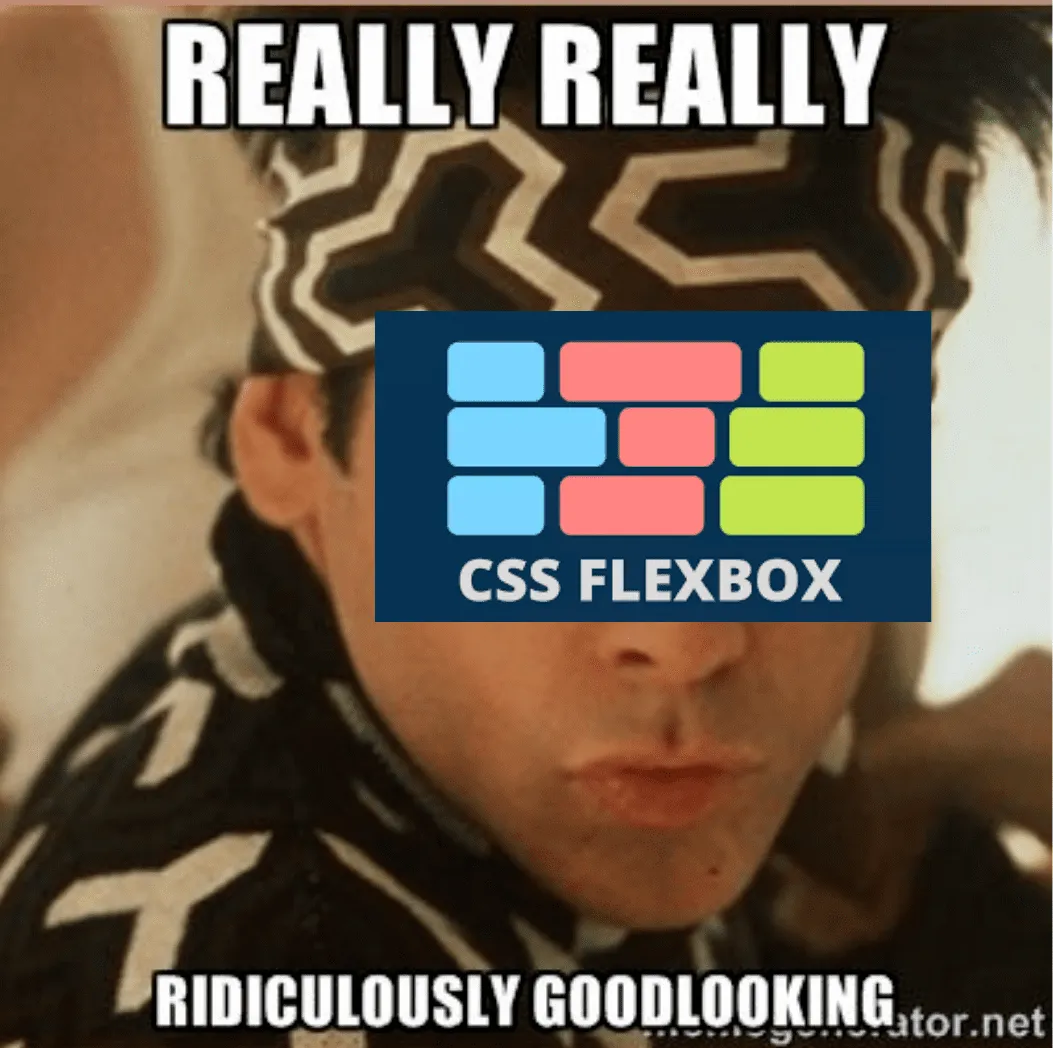
Flexbox
Flexbox was introduced all the way back in 2009 to replace floats, and those ugly leftovers from the nested table days (some trends should stay in 1999). Flexbox is meant for a one-dimensional layout with a column OR row. To accomplish both would require nested flexboxes or use of the flex-wrap property. Do-able, but probably not the best for designs that require the container and its children to maintain certain widths between varying devices.
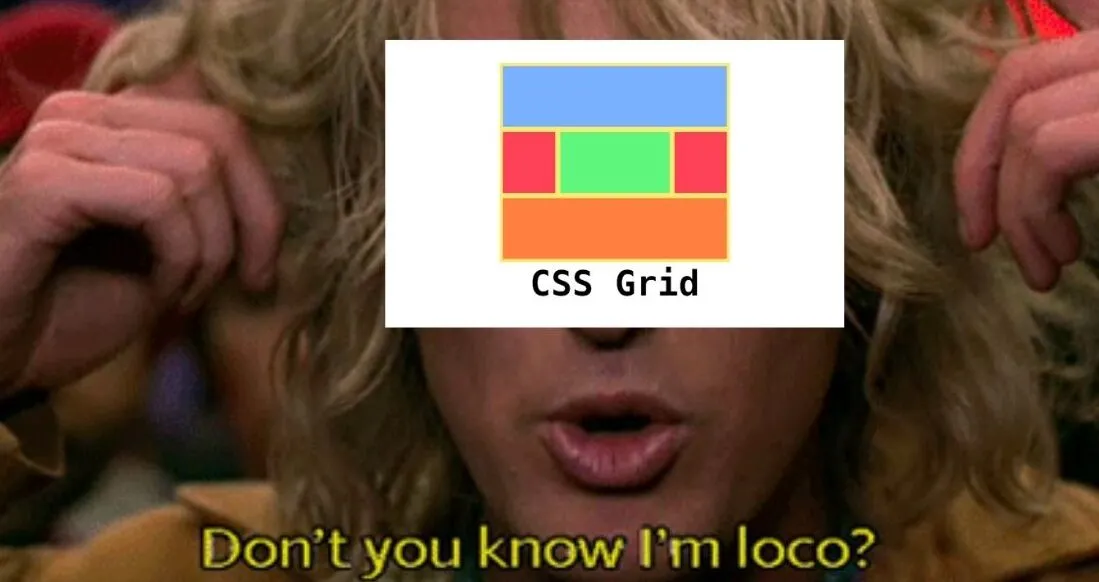
Grid
Grid entered the scene in 2017 with considerable browser support, outside the cursed IE. Unlike Flexbox, Grid allows you to build two-dimensional layouts with each grid cell containing columns and rows. Often Grid is used for one-dimensional designs. Grid works well with one-dimesional designs due to built-in properties that allow for more flexibility (haha) between screen sizes. Struggling with sizing between tablet and mobile? No need to fear. With properties like auto layout, minmax(), repeat, and auto-fill you can usually find a suitable css option.
Preferred Use Cases
The standard advice for when to use Flexbox vs Grid is to look at the overal layout. If you need a full-page layout with multiple colums and rows, Grid would be recommended. For simplier layouts or basic components, Flexbox is the suggested option. However, abiding by these set “rules” can be extremely limiting to potentional layouts. You need to look at the designs on a case-by-case basis and plan out your approach… Or don’t, I’m not the boss of you. I just work here.

Side-by-Side Comparison
I suggest you look at the graphic below. In fact, I HIGHLY suggest it. Learn it. Love it. Forget about it after you finish reading this post. Or maybe you think you’ll forget, but actually this chart burns a hole in your brain like Leonardo DiCaprio in Inception.
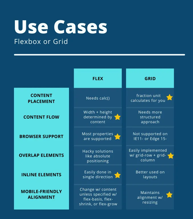
Wow. That’s crazy. What a great chart. The person who made that chart probably has a free-account on Canva or something like that. They must have taken a medicore photoshop class seven years ago in college, and really absorbed the subject matter.
Reasons to be on Team Flexbox
Maybe after looking at that chart, you’re rethinking preconcieved notions about Flexbox. If so, here is a brief summary of why Flex might be the css layout for you:
- Easily wraps elements to fill available space
- Reverse order (row-reverse, column-reverse)*
- Menus or Forms
- Adding elements to existing components within a short time frame
*Acessibility Note: Reordering content with Flex only changes visual rendering. Screen readers will still read in the initial order, so really think before using order or reverse properties. Will this actually help the users’ experience, and if so, is there a better way to do it?
Reasons to be on Team Grid
After all that you’re still sticking with team Grid, huh? Well, good on you. Sometimes the newest is better, and Grid is has great support outside Internet Explorer (which is pretty much defunct at this point). Check out some more reasons Grid is a key player in the layout game:
- Perfectly Aligned rows and columns
- Predictable sizing behaviors
- Better layout performance*
- Use less media queries
*Note: if you’re interested in a more in-depth look at performance comparisons between Grid and Flex, Jake Archibald has a great blog post about it.
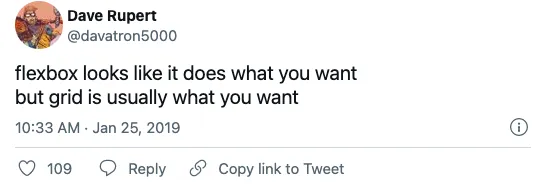
Twitter isn’t just for hate comments
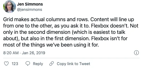
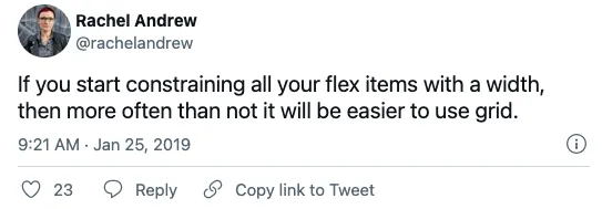
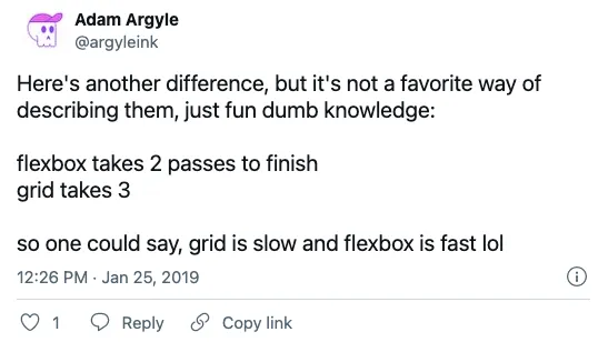
The internet has opinions about Flexbox and Grid usage. No suprise there. Chris Coyier had a post on CSS-Tricks asking what devs preferred and why. Here are a some of their thoughts in tweet form:

CSS-Tricks is a great resource for front-end related content and sends out a weekly newsletter if you’re interested. Go sign up!
Flexbox + Grid = Complex Layouts
Well now that you’ve scrolled through possibly the longest post on this site, I have something important to tell you… Grid and Flexbox can be combined to create layouts. In reality, they’re friends and not enemies. Not everything has to be a competition! With a planned approach these similar tools can be used together. Here is a great example on codepen with a footer menu that looks not so complex, but in reality isn’t a shut and closed case. This is some Lost level trickery and plot twists right here.
Conclusion
And our epic finale is…to just try not to be single-minded about your css. There is no real winner in the Flexbox vs Grid walk off. They can work together or apart, but at the end of the day they are both just tools to accomplish a greater goal. And no, it’s not to kill the Prime Minster of Malaysia.

Want to learn more about the great Flexbox vs Grid debate?